

French Blue Restaurant – Napa Valley, CA
Brand Identity, Menus, Website, Packaging, Signage
A charming farm-to-table restaurant in downtown St. Helena, serving Napa Valley home cooking, handcrafted cocktails, and local wine in a relaxed yet refined setting

French Blue was the vision of acclaimed interior designer Lori Backen and award-winning architect Howard Backen, who brought us in to develop the restaurant’s brand identity.
Inspired by the fresh, organic produce sourced from nearby Rudd Farms Gardens and featured throughout the menu, we designed the French Blue boy logo as a playful symbol of the restaurant’s “farm to table” philosophy. Cheerful and approachable, the logo reflects the spirit of the space—welcoming, wholesome, and full of character.
A signature shade of French blue was used throughout the brand, appearing on custom china, menus, and merchandise, while a striped pattern—echoing the upholstered furniture—added a subtle nod to classic French style. The result is a cohesive and memorable identity that captured the charm of California wine country through a distinctly French lens.
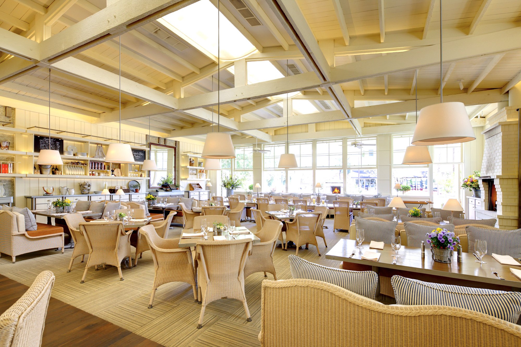


“The 10 Most Beautifully Designed New Restaurants” –Architectural Digest


"Sheila worked with me and Lori Backen on all of our branding: logo development and its applications, web design and ongoing development, menus, all other on-line venues, proprietary/branded retail product line and items like custom china and staff uniforms. We love Sheila. She is a brilliant artist, savvy designer and has helped us navigate our desire for restrained but clear and strong branding."
– Stanley Morris, French Blue Napa Valley


Architecture: Howard Backen (Backen & Gillam Architects)
Interior Design: Lori Backen Interiors
Photography: Eric Wolfinger